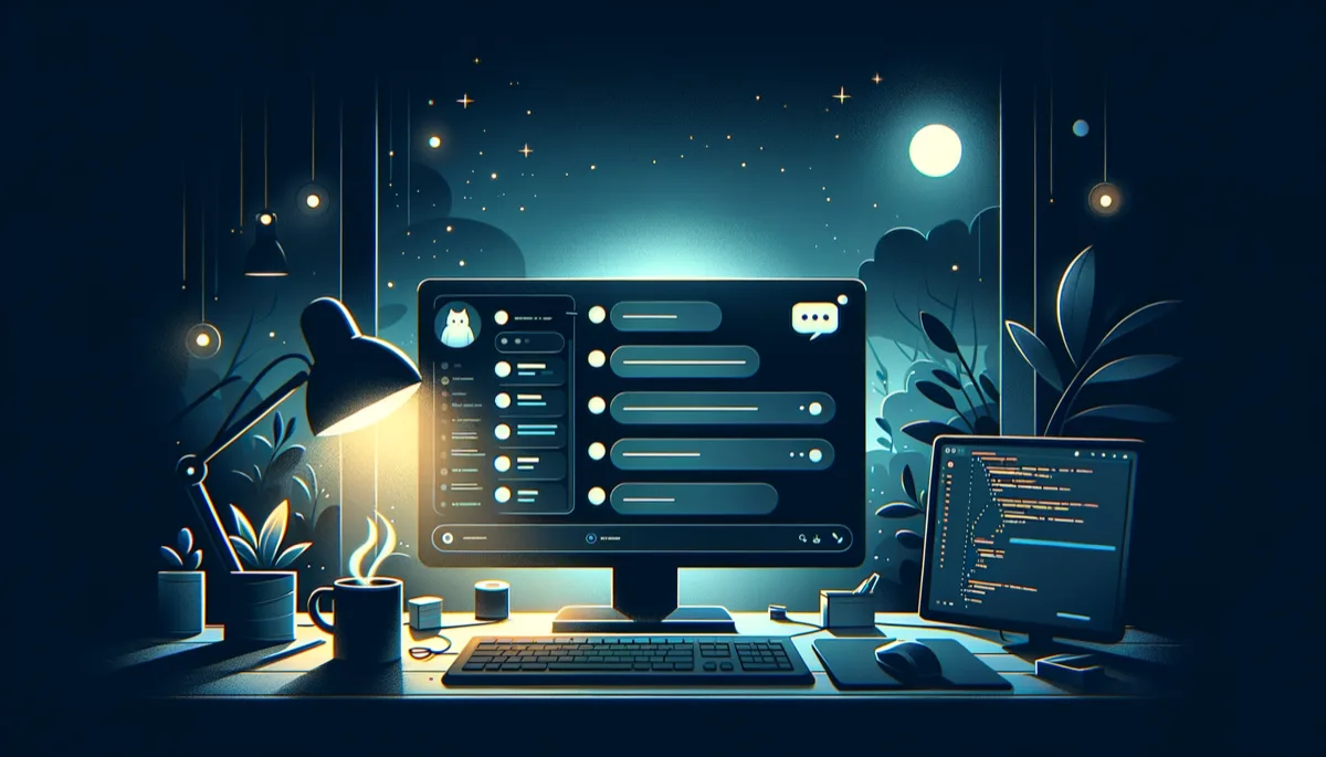
The Chatbot Looked Like ICQ
I open the chat on the site. Click the button, type a message. The reply comes in. Except it all looks like one wall of text. Where’s the bot, where’s me - you can only tell by the “IM” avatar on the left. Hello, 2003.
I decided to clean it up. Not “rewrite from scratch in React with Framer Motion.” Just set the right visual accents in a couple of hours.
What was wrong
Plenty of issues:
- User bubbles and bot bubbles looked identical. Both grey, both the same size, both with avatars. The only difference was alignment, which worked… when the styles actually applied
- The user avatar on the right - an SVG person in a circle. Visual noise. Right alignment and an accent color already say “this is my message”
- The input field and send button lived separately. Two independent elements with a gap between them. Looked like a form from a tutorial
- The bot couldn’t render numbered lists.
renderMarkdownhandled bullets and bold, but1. itemturned into a plain paragraph
Seven changes
Bubbles. User messages got a semi-transparent background - a soft accent instead of blinding white. Bot messages got a thin left border as a visual anchor. Capped both at 75% width so they don’t stretch across the entire screen.
Bot avatar. Slightly larger, added a border, pinned to the top of the message. “IM” stopped floating at the bottom of long replies.
User avatar. Removed. Completely. Right alignment and the accent color already say “this is my message.” Cleaner, quieter, clearer.
Input field. Merged the text field and button into a single visual block. Shared border, shared border-radius. On focus, the whole wrapper highlights. Replaced the divider with a subtle shadow on top.
Numbered lists. The bot can now reply with numbered lists, not just bullets.
Spacing. The last message no longer sticks to the input field.
Accessibility. The submit form got a label for screen readers.
The bug that broke everything
I deployed. Opened the site. Nothing had changed. Absolutely nothing. Same grey rectangles, same stream of text. As if not a single CSS rule had been applied.
Because none had.
Astro scopes styles by default - they only apply to elements that existed at render time. But chat messages are created dynamically via JavaScript. Astro doesn’t know about them, so the styles never reach them. Silence.
The fix was one word: <style is:global>. The selectors are specific enough as-is, no style leakage.
This bug had been living in the chatbot since day one. Tailwind classes in the markup worked (they’re global), but CSS rules targeting dynamic elements were silently ignored. The chat looked like a wall of text not because of bad design - but because there literally was no design. The browser was rendering elements with zero custom rules.
oklch over rgb
Why oklch? The old rgba format is four numbers whose meaning only the author understands. In dark mode, you end up guessing values by feel. oklch separates lightness, chroma, and opacity. oklch(0.985 0 0 / 0.18) reads as “nearly white, no color, 18% opacity.” More readable and more predictable in both themes.
Security
Every time you touch frontend code with innerHTML, it’s worth double-checking. I went through all the changes:
- Markdown rendering escapes special characters before processing - HTML injections are ruled out
- User messages are inserted as text, not as HTML
- Global styles don’t open up CSS injection vectors - all values are hardcoded
- Numbered lists are parsed the same safe way as bullets
No holes. Verified.
Takeaway
Two commits. One file. CSS that finally works. The chatbot stopped looking like a terminal log and started looking like a chat.
The most interesting bug wasn’t in the code. It was in the assumption that “if an element is on the page, the styles will reach it.” In Astro, they will. But only if the element existed at render time. Everything else needs a pass.